“F1 2026. The next chapter starts here.”
That framing set the tone for Red Bull’s launch, and the reaction made clear this was never going to be treated as a routine paint refresh.
A Deliberate Break from the Matte Era
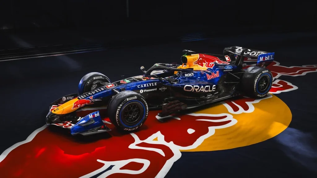
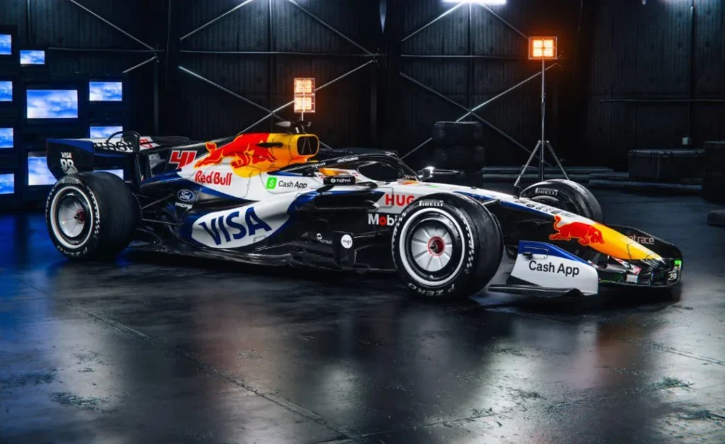
For Red Bull Racing, the shift away from matte is the headline. The glossy finish immediately reframed a livery that, while iconic through Max Verstappen’s rise and domination, had become synonymous with stasis. Fans repeatedly described the matte navy as visually dull, especially as much of the grid followed the same low-paint, bare-carbon philosophy.
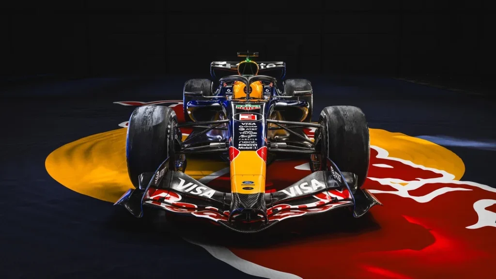
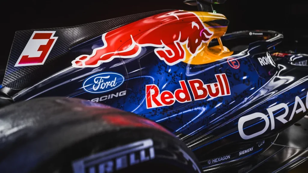
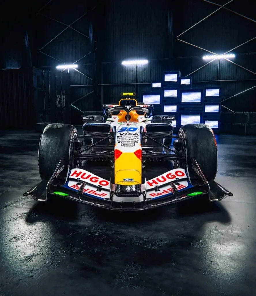
The gloss does more than shine. The blue appears lighter, textured, and layered, some calling it metallic rather than simply glossy. Gradients add depth, the top of the chassis fades toward black, and the return of white outlines around the Red Bull logos was widely praised as overdue. Even those who loved the old look conceded that, after nearly a decade, the change feels earned.
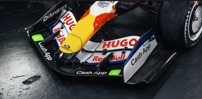
There’s also a regulatory edge to the design. Discussion quickly centered on the new minimum paint requirement, 55% of visible surface area, which Red Bull appear to be running right up against. The tension between aesthetics and performance played out in real time: fans wanted more color, while others pointed out that any rule increasing paint weight would not affect all teams equally. The result is a livery that looks deliberately optimized, not indulgent.
Echoes of Vettel, Without Going Retro
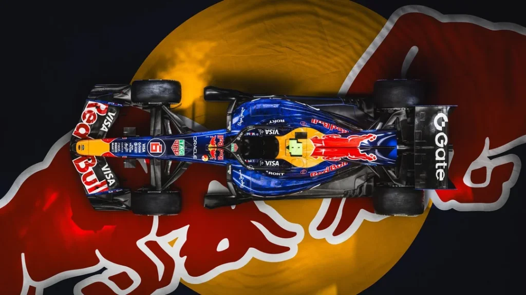
Nostalgia was unavoidable. Many saw clear callbacks to the Sebastian Vettel era: glossy surfaces, brighter blues, white accents, and a general sense that Red Bull have rediscovered their willingness to be visually expressive. Comparisons flowed freely, pre-Infiniti Red Bull liveries, the early 2010s grid, even the famed Suzuka Bull special livery, which some still consider untouchable.
Yet the consensus was that this is not a throwback for its own sake. It is “same same but different”, a modern interpretation that closes the Verstappen-era matte chapter while not pretending it never happened. Several fans framed it as a symbolic reset: management upheaval, new regulations, and a visual language that signals reinvention rather than continuity.
Simon R: From Fan Concepts to the Grid
One of the most celebrated aspects of the launch was authorship. The livery was designed by Simon R, a designer known for producing fan concepts for years before making the leap to official work. His résumé already included last year’s white Red Bull and the Las Vegas VCARB livery, and many noted how this 2026 design feels like the culmination of that trajectory.
The reaction was not just admiration for the end product, but for the story itself. Fans openly called it “every F1 fan’s dream”, watching someone go from posting concepts online to shaping the identity of a front-running team. Comparisons to Sean Bull’s career path surfaced as well, alongside debate about how brand constraints can either enable or stifle creative freedom.
Racing Bulls Steal the Spotlight
If Red Bull’s gloss signaled evolution, Racing Bulls delivered disruption.
The Racing Bulls livery triggered an immediate and visceral response, driven almost entirely by one element: white wheel covers. The reaction was emphatic, “they have to stay”, with fans pairing them mentally with hard tires and historic references like Benetton’s B194. For many, this single choice elevated the entire car.
The rest of the package reinforced the excitement. A darker blue, more exposed carbon, and a glossy finish carried forward hints of last year’s identity while refining it. Several commenters went further, stating outright that Racing Bulls’ car looks better than Red Bull’s, a rare sentiment for a junior team.
Show Cars, Renders, and the Aero Rabbit Hole
Unlike many livery launches, this one quickly spilled into technical territory. Observers noticed that Racing Bulls’ front wing philosophy in the renders looks radically different from Red Bull’s, wider noses, distinct endplates, and alternative placement of active aero actuators.
This sparked a long-running debate: what was real, what was render, and what, if anything, was being intentionally obscured. The prevailing view settled on this: the cars on stage were FIA show models, while the renders likely reflect pre-testing prototypes or deliberately misleading representations. Veterans of the sport were quick to remind everyone that teams have a long history of launching cars that teach rivals nothing.
What mattered more was the implication. The visible divergence reinforced the reality that Red Bull Racing and Racing Bulls are legally and operationally separate entities. Design sharing is prohibited, and Racing Bulls are widely seen as a proving ground for both drivers and engineers. Whether the differences hint at genuine philosophical splits or pure bluffing remains unknowable, but the fact that fans were dissecting wing elements at a livery launch says plenty.
Ford Blue and the Weight of Expectation
Off-track visuals fed into the narrative as well. Red Bull’s new team kit is conspicuously blue, igniting speculation about how deeply Ford’s identity would be integrated. Some expected a blend of Vettel-era Red Bull and Ford Racing blue; others referenced F1 Academy cars and even late-1990s Sauber liveries as mental templates.
What unified the discussion was relief. After years of near-identical presentations, fans felt Red Bull were finally willing to move again. Even those who loved the matte era acknowledged that gloss alone ensures this car will stand out on a grid still dominated by flat finishes.
A Launch That Felt Like a Line in the Sand
The launch event itself was met with mixed feelings, corporate in tone, fleeting in substance, punctuated by Max Verstappen’s brief appearance and immediate departure. Yet that almost reinforced the message. The spectacle was less about speeches and more about signaling intent.
Taken together, Red Bull and Racing Bulls didn’t just unveil new liveries. They marked the end of one visual era and the start of another, embraced gloss in a matte-heavy field, and, perhaps most tellingly, gave fans something genuinely new to argue about.
In Formula 1, that might be the clearest sign that a new chapter really has begun.