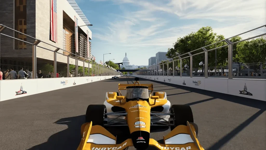
IndyCar’s highly anticipated Freedom 250 Grand Prix in Washington, D.C. took a step forward with the release of a virtual course preview—but if the goal was clarity, the early reaction suggests the execution missed the mark.
What was billed as a “virtual tour” landed, for many, as something far less definitive. Instead of offering a clear, corner-by-corner understanding of how the circuit will flow through the National Mall, the preview felt more like a teaser—stylized, fast-paced, and ultimately difficult to interpret.
A Tour in Name Only
The most consistent takeaway is simple: this wasn’t really a tour.
From a viewer standpoint, the video appeared to skim across only a handful of sections without establishing a coherent sense of geography. Rather than orienting fans within one of the most iconic urban backdrops in motorsport history, the presentation left many asking a fundamental question—where exactly is anything happening?
That lack of clarity led to broader skepticism about whether the preview actually reflects the finalized layout in a meaningful way, or if it’s simply an early-stage visualization.
Style Over Substance
The editing approach didn’t help. The rapid cuts and exaggerated pacing gave the impression of speed, but at the cost of readability.
The result felt closer to a cinematic montage than a technical breakdown—more “action sequence” than engineering preview. That stylistic choice may have been intended to build hype, but instead it created confusion around key elements like braking zones, corner sequences, and elevation changes.
Even on-track battles depicted in the render—cars swapping positions mid-corner at unrealistic speeds—came across as more theatrical than representative, further blurring the line between simulation and spectacle.
Layout Confusion and Perspective Issues
Beyond presentation, there were also questions about the circuit itself—or at least how it was shown.
Some viewers struggled to reconcile what they saw in the video with the previously released track map. Specific sections, such as the esses, appeared difficult to place within the real-world geography of the National Mall. Others noted discrepancies in how the circuit interacts with landmarks like the Reflecting Pool, suggesting the visual angles and rendering may be distorting the layout.
To be fair, there were attempts to clarify that what’s shown is a 3D-rendered version of the official map, complete with infrastructure elements like grandstands, suites, pedestrian bridges, and paddock areas. But even with that context, the perspective and camera work seem to exaggerate certain features—particularly lane shifts—making the track harder to interpret rather than easier.
Early Days—or Missed Opportunity?
There’s also an underlying acknowledgment that this is still early in the process.
At this stage, the priority may not be delivering a perfectly polished promotional product, but rather continuing to build out the logistics of staging a race in one of the most complex urban environments imaginable. From that perspective, a rough preview is understandable.
However, for a first impression tied to such a landmark event, the lack of clarity feels like a missed opportunity. The Freedom 250 isn’t just another race—it’s a statement event, tied to a historic location and a major milestone. A more grounded, informative introduction could have gone a long way in building confidence and excitement.
The Bottom Line
Right now, the Freedom 250’s virtual tour raises more questions than it answers.
There’s clear intrigue around the concept of IndyCar racing through Washington, D.C., but the initial visualization hasn’t yet translated that potential into something fans can fully grasp. Until a more detailed and coherent breakdown emerges, the circuit remains—at least visually—more idea than reality.
For an event of this scale, the next iteration will need to do more than look fast. It will need to make sense.