Ferrari’s New Look, Old Problems: When Presentation Becomes the Story
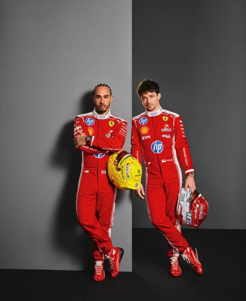
Ferrari’s newly released race suit look book was meant to spotlight a refreshed visual identity, but the immediate reaction focused less on design intent and more on execution. The post-production treatment flattened the drivers to the point where they appeared artificial, lighting inconsistencies made Charles Leclerc and Lewis Hamilton look nearly identical in tone in the final image, undercutting the premium aesthetic Ferrari clearly aimed for.
That surface-level critique quickly gave way to a deeper, recurring frustration: sponsorship dominance. The HP branding once again became the focal point, not because of its presence, but because of its treatment. The bright blue logo continues to clash with Ferrari’s red, drawing attention away from the team identity rather than integrating into it. This is particularly notable given broader awareness that HP does allow partners control over lockup design, making Ferrari’s continued choice feel deliberate rather than constrained.
The irony is that many elements of the suit itself landed well. The retro-inspired white collar was widely seen as a strong design choice, and the brighter red tone rekindled hope that Ferrari’s 2026 livery might move away from the darker, burgundy-leaning shades of recent years. Yet those positives were drowned out by visual overload. With multiple HP placements, plus additional sponsors like ZYN and UniCredit, the overall effect was one of clutter rather than cohesion, an imbalance that significantly diluted the intended impact.
Ferrari once again finds itself in a familiar position: one sponsor logo away from something genuinely special.
Baby Blue, Big Problems: Ferrari’s Missed Opportunity with Contrast
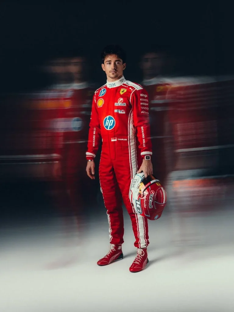
Leclerc’s own tease, still red, but now with a touch of baby blue, reopened discussion around Ferrari’s most successful recent deviation: the Miami 2024 livery. That design proved how subtle blue accents, when thoughtfully integrated, could elevate Ferrari’s look without compromising heritage. The matching “vintage overall” race suits completed the picture, reinforcing how effective cohesion between car and apparel can be.
Yet even that high point is remembered with caveats. The HP logo managed to clash with both red and blue simultaneously, a feat that continues to define Ferrari’s modern visual era. Suggestions that HP could have used its simplified monochrome logo, removing the blue circle entirely, only underline the frustration. The prevailing assumption is that the blue was intentionally selected to stand out, fulfilling its advertising function at the expense of aesthetic harmony.
Functionally, the logic behind logo placement is understood: smaller logos for close-ups and interviews, larger ones for long-distance broadcast visibility. Visually, however, the result remains divisive, especially the oversized placement on the torso, which many see as crossing from sponsorship into distraction.
Layered beneath all of this is an undercurrent of emotional fatigue. The phrase “aura farming before the typical Ferrari experience” captures a growing sense that presentation is doing more heavy lifting than performance, and that even Leclerc’s long-term future at Ferrari feels increasingly uncertain.
Marko Looks to 2026: Mercedes Power and an Unsettled Future
According to Autosport, Helmut Marko expects the 2026 World Champion to come from a Mercedes-powered team, naming Mercedes, McLaren, Williams, and Alpine as contenders. The reasoning is straightforward: power unit performance is expected to be decisive under the new regulations.
Reaction to that assessment was anything but unanimous. While raw performance is seen as critical, skepticism remains around reliability. The prospect of a dominant engine that fails to finish races evokes memories of past regulation resets, including Red Bull’s early struggles before reliability was rapidly resolved. The broader consensus is pragmatic: adding reliability is easier than finding pace.
Marko’s projection also reopened the door to long-dormant nostalgia. The idea of McLaren versus Williams title fights feels like a deliberate throwback, reigniting discussion around classic liveries and eras, even as modern branding realities make such visual throwbacks unlikely. Beyond aesthetics, the driver hypotheticals took center stage: Norris, Sainz, Albon, and Russell all emerged as plausible protagonists in wildly different championship narratives.
What this moment underscores is uncertainty. 2026 isn’t just a regulation reset, it’s a reputational one. For some teams, it’s a chance to reclaim former stature. For others, it’s a risk of being exposed.
Honda RA626H: Hope, Trauma, and the Weight of History
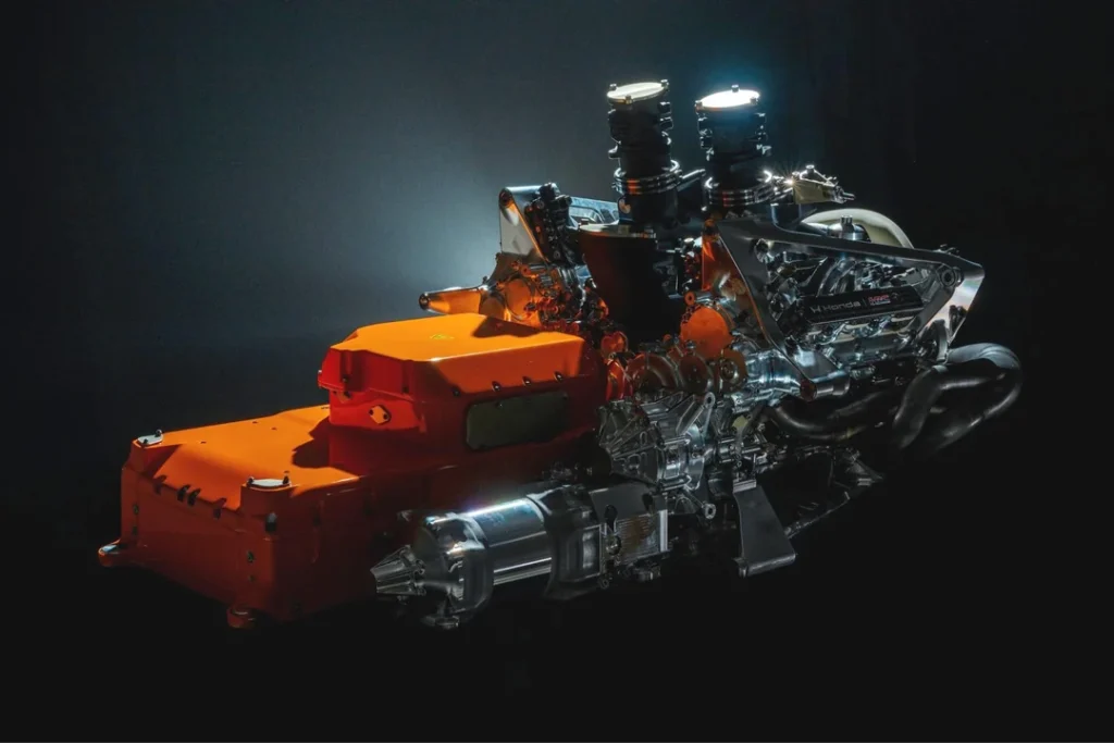
The first looks at Honda’s RA626H power unit sparked immediate fixation on packaging, specifically the noticeably large battery enclosure. Technical speculation quickly followed: while energy storage limits remain unchanged, the enclosure likely reflects increased cooling requirements and the integration of the MGU-K, rather than a fundamental leap in capacity.
That rational analysis exists alongside something far less technical: emotional scar tissue. References to past Honda eras, especially its turbulent partnership with Fernando Alonso, hover heavily over any discussion of performance. Optimism is present, but it’s cautious, almost ritualistic, as if vocalizing belief might somehow invite disappointment.
The familiar cycle is unmistakable: early confidence, creeping doubt, gallows humor, and the quiet expectation that true competitiveness may only arrive after key figures move on. Honda’s modern resurgence has earned credibility, but history ensures that every new promise is met with restraint.
McLaren’s 2026 Kit Leak: When Merchandise Becomes the Problem
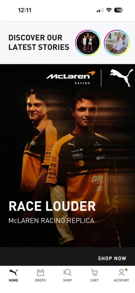
The leaked McLaren 2026 team kit reignited a longstanding debate around F1 merchandise and identity. The design itself, retro-inspired with heavy sponsor application, wasn’t seen as innovative so much as formulaic. Sponsor density once again dominated the conversation, reinforcing the idea that modern teamwear often prioritizes advertising over wearability.
This stands in contrast to McLaren’s more restrained collaborations in recent years, particularly higher-end items that emphasized quality materials and minimal branding. Those pieces were perceived as clothing first, merchandise second, a distinction many fans increasingly value.
The issue isn’t sponsorship itself. Formula 1 has always been a moving billboard. The issue is context. When teamwear reaches price points approaching luxury fashion, the tolerance for looking like unpaid advertising collapses. Excessive logos, especially in visually aggressive placements, undermine both perceived value and brand appeal.
Comparisons to other teams only sharpened the critique. Audi’s clean aesthetic drew praise from some and criticism from others for feeling cold or unfinished, while Mercedes’ reliance on black continues to benefit from fashion’s built-in bias toward minimalism. McLaren, meanwhile, finds itself caught between nostalgia for its triangle-era designs and frustration with its current visual direction.
The lingering concern is telling: when fans dislike both the kit and fear for the livery, confidence in a team’s broader creative vision starts to erode.
The Common Thread: Visibility Over Identity
Across Ferrari, McLaren, Honda, and the looming 2026 reset, one theme repeats itself: visibility is winning out over identity. Sponsors dominate design decisions. Presentation attempts to compensate for uncertainty. Nostalgia fills gaps left by unanswered performance questions.
None of this exists in isolation. Liveries, kits, power units, and driver narratives are increasingly intertwined, shaping perception long before a car turns a wheel. As Formula 1 moves toward its next era, teams aren’t just fighting for lap time, they’re fighting to control their image in an environment where every visual choice is scrutinized as closely as any on-track result.
And in that battle, restraint may once again become the rarest competitive advantage.