The 2026 Formula 1 grid is complete, and visually, it may be one of the most debated in recent memory.
There’s a strong argument that this is the most aesthetically cohesive and modern-looking grid in years. Not just because of the liveries, but because of the car shapes themselves. Some longtime fans compare it favorably to 2006, a season remembered fondly for visual sharpness. Yet at the same time, there’s clear nostalgia for the era of bright yellow Renaults, pink Force Indias, and the blue Toro Rosso, when color separation across the grid was unmistakable.
That tension between modern branding discipline and old-school visual diversity defines much of the 2026 conversation.
Cadillac: Chrome Concept vs On-Track Reality
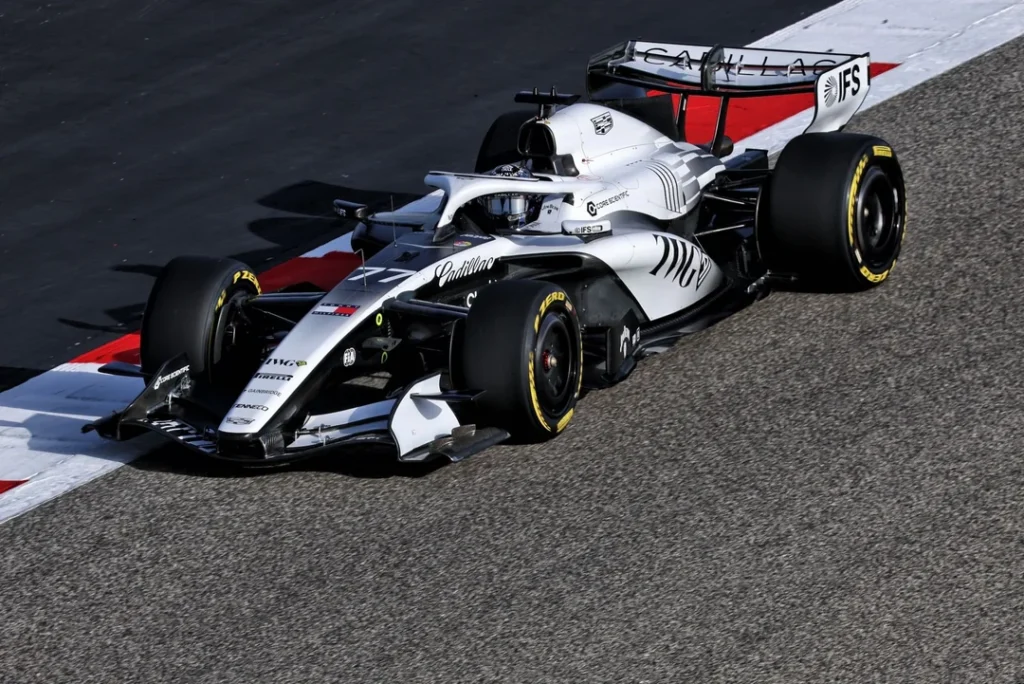
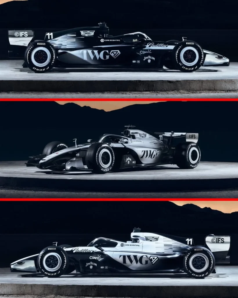
Cadillac’s debut livery might be the most dissected of the lot.
The reveal emphasized a chrome-inspired concept, using black, white, and silver to simulate reflective chrome surfaces rather than running a literal chrome wrap. On paper, it was clever and brand-consistent, aligning with Cadillac’s metallic identity.
But Bahrain shakedown images complicated the narrative.
The real car appeared matte rather than reflective. Chrome accents from the render were absent. The white wall-style wheel rims shown at launch were gone. The halo lacked the shine seen in official imagery. What was presented as a high-contrast chrome illusion instead looked flat to many observers.
Speculation followed quickly. Perhaps the chrome was difficult to replicate consistently. Perhaps performance considerations made real chrome impractical. Perhaps the team used an earlier iteration for testing. Perhaps glare was a concern. Whatever the reason, many felt the execution didn’t match the ambition of the reveal.
Color became the second major issue. A large segment of fans believe Cadillac was the perfect candidate to reintroduce yellow to the grid, or at least integrate the gold, red, and blue tones from its emblem for stronger brand depth. Instead, the grayscale approach has been described as overly safe, lacking standout identity in low-light broadcast conditions.
That said, there’s also a strong counterargument: the restraint is intentional. Cadillac avoided sponsor color clashes. There are no disruptive mis-matched logos interrupting the base design. In a season where some cars risk looking like multi-colored patchwork, Cadillac chose visual discipline.
The divide is clear. Some see refined minimalism. Others see a car that risks blending into the pack.
Haas: Precision Over Flash
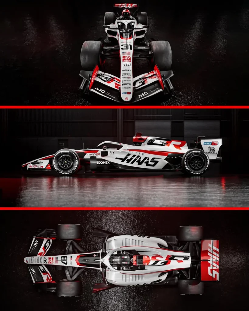
If Cadillac divided opinion, Haas quietly emerged as one of the most consistently praised liveries.
The strength of the design lies in fundamentals:
- A largely uninterrupted white base
- A flowing red stripe that connects the car front-to-back
- Sponsor and team logos that follow the curvature of the bodywork
- Balanced red accents placed with symmetry across wing, engine inlet, cockpit, and rear
The integration of TGR branding has been highlighted as particularly cohesive with the Haas color scheme.
There’s nothing overly experimental about the design. And that’s precisely why it works. It looks deliberate. It looks like a racing car. It doesn’t rely on visual tricks or exaggerated contrast. It simply gets the basics right.
Even skeptics acknowledge that, regardless of performance, Haas may benefit from visibility because of how clean and intentional the livery looks on track.
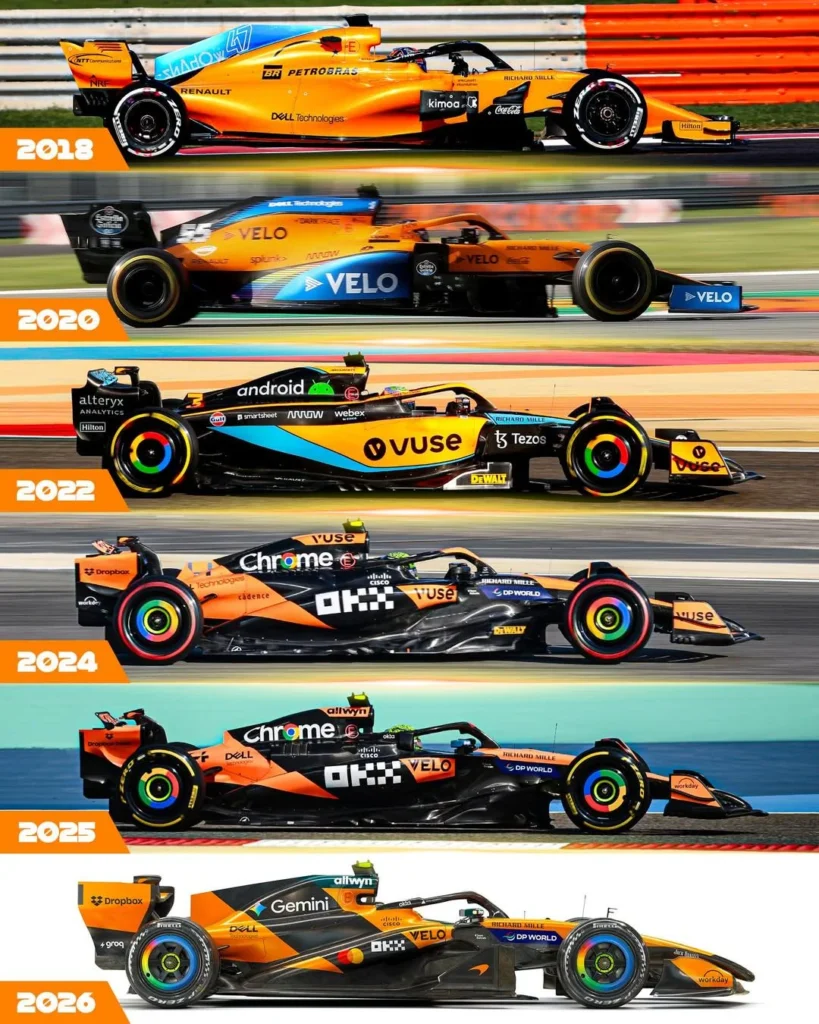
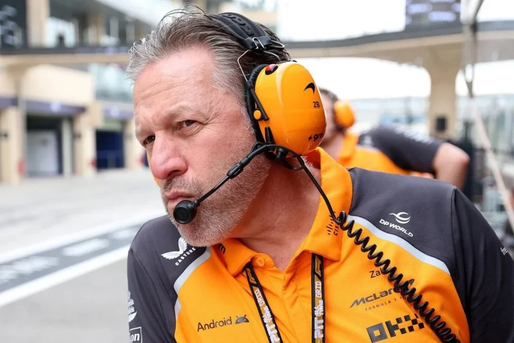
McLaren: Papaya as Identity, Not Experiment
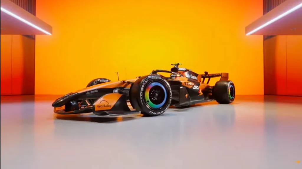
The MCL40 has reignited a familiar debate: when does consistency become stagnation?
McLaren has leaned fully into papaya as its modern identity, positioning it the way Ferrari owns red and Aston Martin owns British racing green. Management has made it clear that championship-winning liveries are not easily changed.
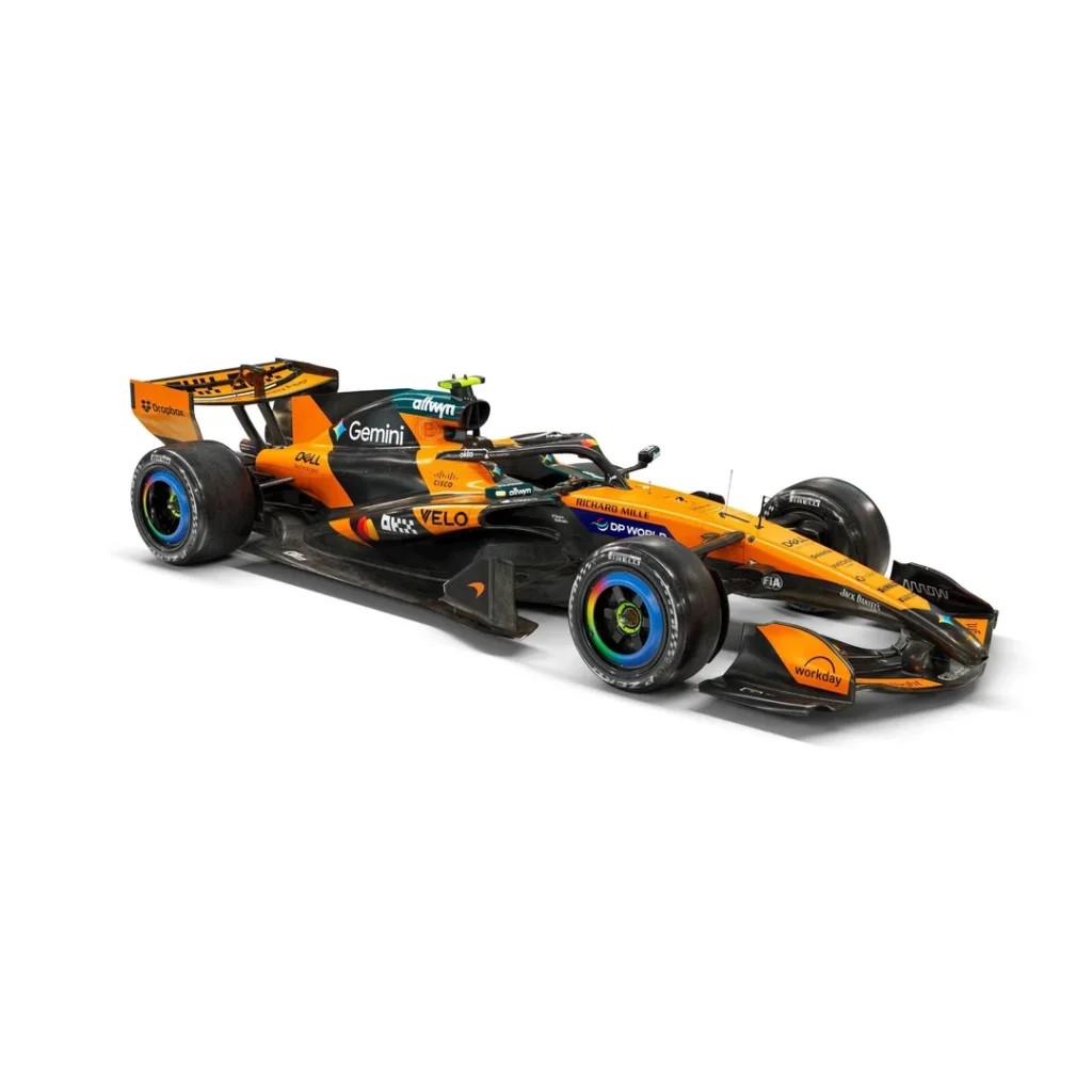
That philosophy is evident. The base structure remains papaya framed by black. Variations are subtle: stripe thickness, minor sponsor repositioning, detail refinements.
For some, this is brand maturity. Papaya is instantly recognizable. Changing it would dilute equity.
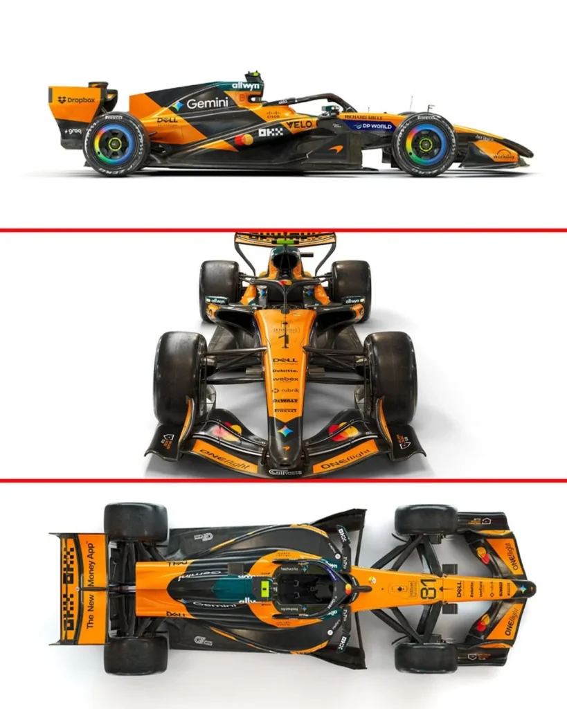
For others, the design feels increasingly safe. The heavy black framing of papaya sections has drawn criticism, especially on elements like the front wing where orange can appear applied rather than integrated. Several fans still consider 2019 the peak modern papaya era, while others argue the 2020-21 variations were more balanced. The Gulf special editions remain widely admired.
Sponsor presence is another focal point.
Mastercard’s relatively modest placement surprised many, especially given title sponsor status. Google Gemini branding and Chrome wheel elements appear more visually dominant in certain angles. This has sparked debate about whether modern F1 sponsorship is less about size of logo and more about integrated branding across team naming rights, suits, and global marketing presence.
Color harmony also divides opinion. Allwyn’s teal and DP World’s blue introduce competing tones that some feel disrupt the papaya-black identity. Others see it as the inevitable reality of a team with dozens of commercial partners.
What’s undeniable is that McLaren has committed to papaya long-term. Whether that decision ages like Ferrari red or eventually demands reinvention will depend on performance cycles.
Ferrari, Audi, and the Matte vs Gloss Question
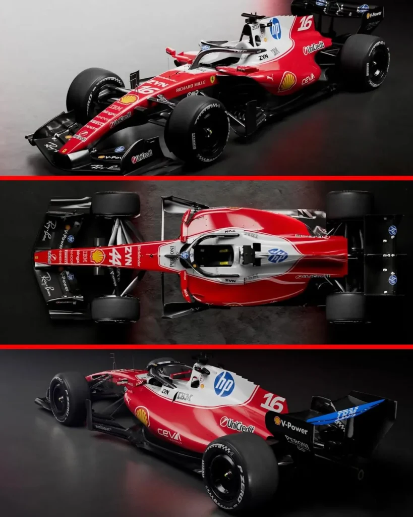
Ferrari’s 2026 execution has drawn mixed reviews, with particular criticism aimed at airbox color choices and sponsor integration that some feel lacks cohesion. The comparison to prior controversial design eras resurfaced quickly.
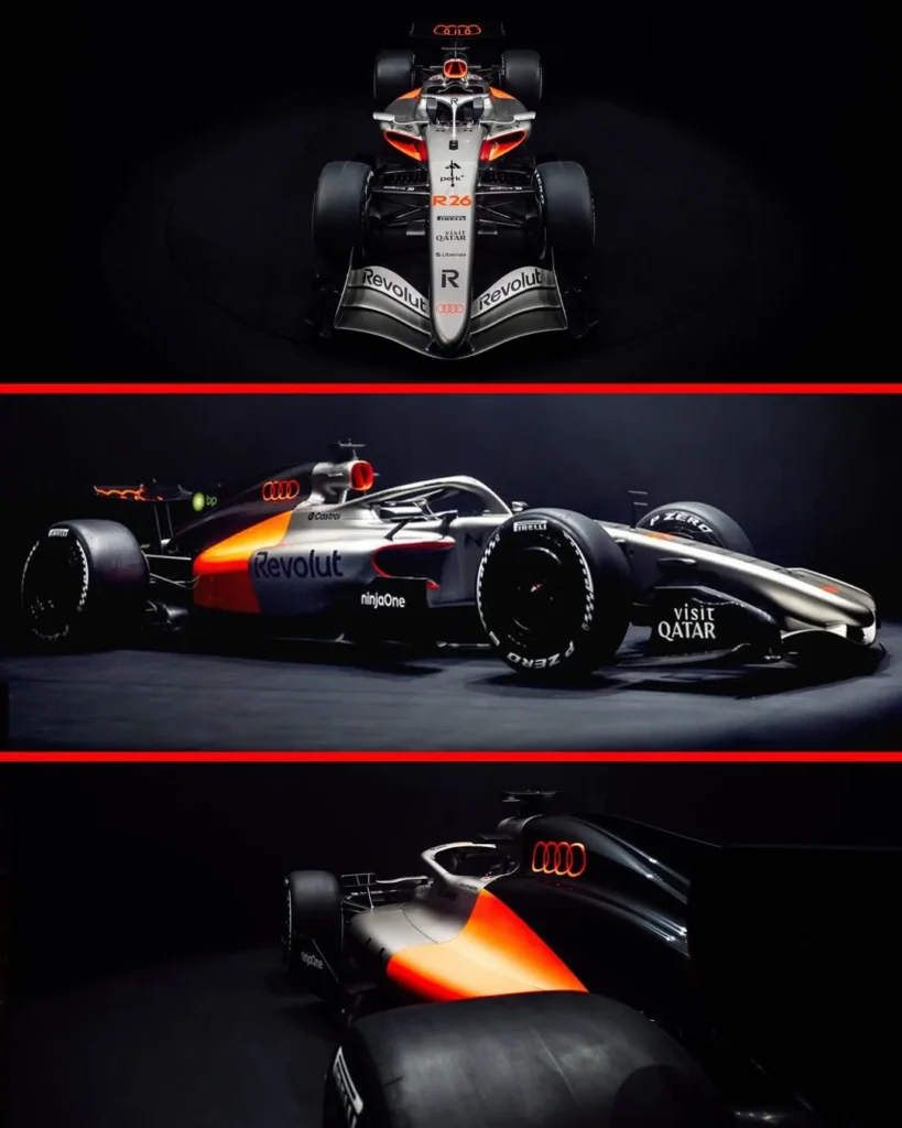
Audi’s silver has been viewed more favorably in natural-light footage than in studio renders, but there’s ongoing debate about whether a glossy metallic finish would better capture the legacy of iconic silver F1 cars from past decades.
More broadly, matte finishes are under scrutiny.
There’s a belief that certain cars, Audi silver, Cadillac white, Aston Martin green, would benefit dramatically from sunlight reflection. Others defend the brushed-metal aesthetic as modern and purposeful.
One concern lingers across teams: from a wide camera shot, several cars risk blending into a predominantly black-grey-white-blue visual field. In that context, the absence of yellow on the grid stands out as a missed opportunity for differentiation.
Lando Norris’ Helmet: Continuity Done Right
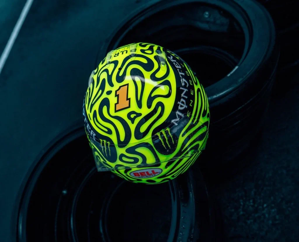
Amid livery debates, Lando Norris’ 2026 helmet stands out for the opposite reason: consistency.
The design has become instantly recognizable, moving away from earlier influences and establishing its own identity. Subtle references to his number remain embedded in stripe details and logo structure. The stylized “Lando” graphic integrates a four, reinforcing brand cohesion.
Helmet continuity matters. When a driver wins a championship in a particular design, it becomes part of visual legacy. Norris’ approach reflects that understanding.
In a grid of evolving liveries, personal identity remains one of the most powerful branding tools in the sport.
Mercedes Engines and the Parody Era
Zak Brown’s insistence that the Mercedes power unit is legal triggered a wave of exaggerated, theatrical commentary online, parodying political speech patterns while repeatedly emphasizing legality.
Behind the humor sits real competitive tension.
If Mercedes does indeed have the engine to beat under the new regulations, customer teams stand to benefit, provided everything passes regulatory scrutiny. But customer teams don’t sit at the engine decision-making table. Protests and political battles happen at manufacturer level.
Rumors surrounding Audi’s power unit reliability, including concerns about harmonic resonance and durability, have circulated, though even those sharing them acknowledge the speculative nature of preseason chatter.
The broader expectation is that early regulation cycles produce larger performance gaps. New entrants like Cadillac and Audi will not have an easy runway.
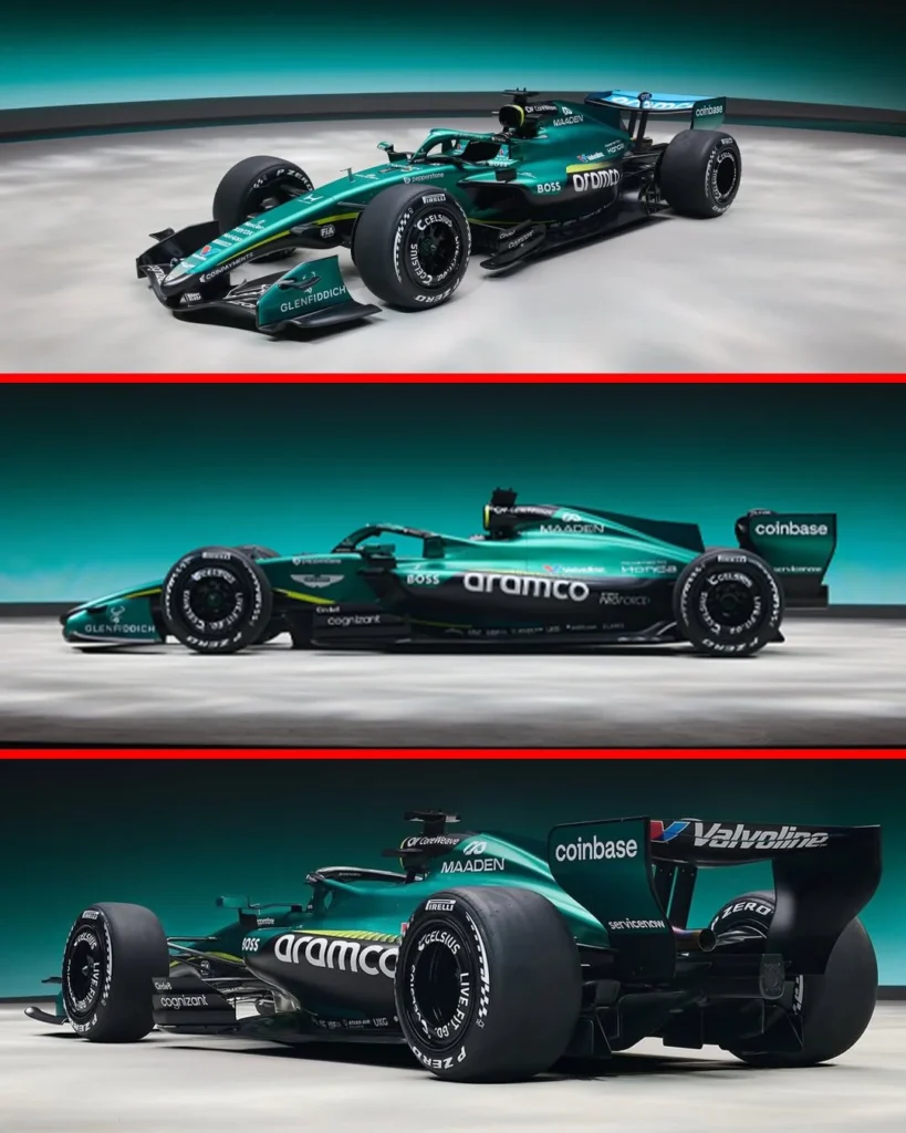
Aston Martin: Leadership Flux Continues
Off-track, Aston Martin’s management reshuffle has intensified scrutiny.
Andy Cowell’s departure follows a series of internal shifts coinciding with Adrian Newey’s increasing influence. Cowell, an accomplished engine leader with deep Mercedes experience, was initially positioned as CEO and Team Principal before being moved into a Honda relationship role. Now, he exits entirely.
The pattern of demotions and departures has led some to describe upper management as unstable. Others argue this is the inevitable restructuring that occurs when a figure like Newey is given broad authority.
Questions naturally arise: technical brilliance does not automatically translate to effective team principal leadership. History has shown that distinction matters.
Whether Newey’s tenure as TP, even if described as temporary, becomes a defining success or an unexpected misstep remains to be seen.
The Competitive Landscape: No Easy Targets
Sergio Perez’s comment that Cadillac would be disappointed to finish last triggered predictable reactions. Of course they would. So would anyone.
The more interesting takeaway is this: the grid is tighter than ever.
There are no obvious “bad teams.” For Cadillac to avoid the back, it must outperform established operations. Alpine may benefit from switching away from the Renault power unit. Audi’s competitiveness may hinge heavily on engine performance. Ferrari-powered teams could benefit from close manufacturer collaboration.
If Cadillac finishes last, it won’t be for lack of ambition. It will simply mean the car wasn’t fast enough.
A Grid That Demands Attention
The 2026 season hasn’t even begun, yet the conversation is already layered:
- Chrome vs matte
- Papaya vs nostalgia
- Gloss vs brushed metal
- Brand identity vs sponsor sprawl
- Engine legality vs preseason rumor
- Technical genius vs management reality
Some fans see one of the best-looking grids in years. Others see missed opportunities for boldness. Nearly everyone has strong opinions.
Which, in many ways, is exactly what Formula 1 should be provoking.