At the 2025 Canadian Grand Prix, Haas F1 Team celebrated its 200th race with a surprise, and for once, it wasn’t a meme-worthy spin or Rich Energy flashback. It was a genuinely sharp, deeply nostalgic, and emotionally resonant livery that immediately captured the attention of fans, pundits, and designers alike.
The throwback design, modeled after Haas’ original 2016 grey-and-red color scheme, wasn’t just another race-week refresh. It was a visual love letter to the team’s tumultuous, unpredictable, and often underrated legacy.
Let’s take a moment to celebrate the 200th Grand Prix not just by admiring the new livery, but by exploring what every livery before it meant. The good, the bad, the baffling, and now, finally, the brilliant.
2016: Where It All Began – Minimalism or Missed Opportunity?
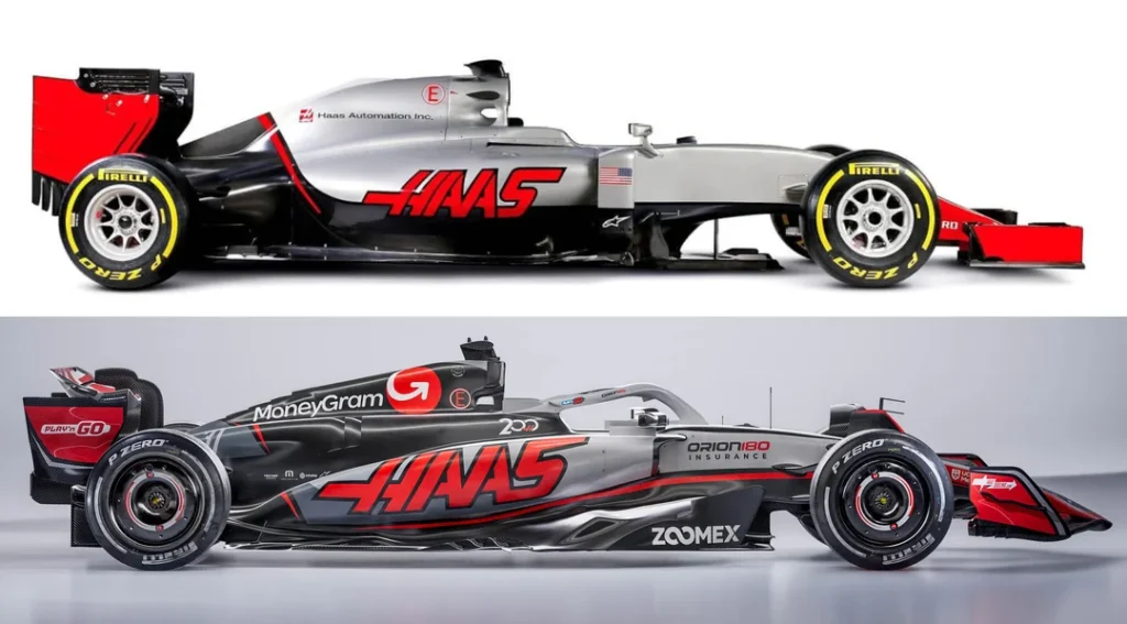
Haas entered F1 with a clean slate, literally. The VF-16’s grey-and-red livery was sparse, especially compared to Ferrari, their technical partner. The nose was sharp, the color palette neutral, and the sponsor count… negligible.
There was debate over whether this was an intentional, sponsor-waiting strategy or just Gene Haas flexing his personal brand. We noted at the time that the starkness almost made the car feel more industrial than inspirational. That said, the design was unmistakably Haas, and it turns out that identity would age better than expected.
2017–2018: Shark Fins, Diffusers, and the HALO You Didn’t Notice
As Haas evolved, so did their design language, but only slightly. The matte textures came in, shark fins drew attention, and fans began noticing the subtleties. Most notably, the 2018 livery made a strong effort to blend the newly mandated HALO system into the bodywork using black paint and smart lighting, a move that made the safety structure nearly invisible in promotional images. It was clever, minimalist, and pure Haas.
Meanwhile, the aero complexity skyrocketed, bargeboards were described as “mental,” with Ferrari-inspired sidepods and t-wings grabbing attention. If the livery wasn’t making statements, the airflow certainly was.
2019: The Gold Rush of Chaos — Rich Energy & the Lotus Cosplay
Then came the black-and-gold era. Haas partnered with Rich Energy, and the result was one of the most chaotic and meme-rich liveries in modern F1 history. The design was gorgeous, evocative of Lotus, but plagued with backward logos, mismatched updates, and a rapidly imploding partnership.
The Singapore spec stood out for all the wrong reasons: awkward white patches, poor contrast, and a paint scheme that fans half-joked, half-cringed at. The visual mess reflected the team’s on- and off-track confusion.
Yet, it was memorable, so memorable that even now, fans (including us) can’t help but joke about bringing it back for the drama alone. It cemented Haas’ identity as F1’s lovable, unstable underdog.
2020: Wind Tunnels, Gloss Black, and Renewed Hope
The 2020 livery moved away from extremes and into something smoother: black, white, and functional. Beneath the surface, wind tunnel correlation issues were creating headaches, but from the outside, it looked composed, almost elegant.
It marked the first time fans (and we) saw Haas not as a meme team, but as a group trying to take a serious step forward. The details were tighter, the branding more cohesive, and the design reflected a team searching for structure.
2021: The Flag Controversy That Overshadowed Everything
Then… Russia. Literally.
The 2021 livery, seen by many as a political statement veiled in “national color alignment,” was unmistakably tricolor, white, blue, red, in that exact order. It coincided with the arrival of Nikita Mazepin and quickly ignited a backlash.
Even fans who liked the design aesthetics admitted the context made it “hard to appreciate.” Some yearned for a Mick Schumacher tribute instead, something more genuine, less performative. For better or worse, this was a pivotal turning point: the livery had impact, but not the kind anyone wanted.
2022: Gloss Black, Flex Seal Jokes, and “Emotional Damage”
With Mazepin out, the 2022 livery turned to clean white and gloss black. It had moments of style, particularly the US GP edition, but also became a target for some of the sport’s funniest commentary.
One line stuck with us and the community: “The white goes nice with blue flags.” Ruthless, yes, but cuttingly accurate at the time. The design was clean, even classy in some spots, but the performance didn’t elevate it. Still, fans appreciated the effort: cleaner fonts, glossier textures, and a step away from controversy.
2023: The Carbon Fiber Diet and Uno Reverse Cards
Bare carbon became the rage across the grid, and Haas joined in. The blacked-out panels weren’t just about style, they were about weight-saving. Some fans joked that the team “picked up five cans of gloss spray paint at the hardware store,” while others noted the clever integration of performance-first livery design.
Then came the memes: the MoneyGram logo looked like a reverse Uno card; the “refresh” button supposedly summoned Romain Grosjean; the tires wore out just from being rolled into the photo studio. In short, classic Haas energy, awkward but endearing.
2024: A Livery with Haas Written All Over It (Literally and Figuratively)
The 2024 Haas livery marked yet another iteration of the team’s now-familiar identity, a blend of carbon black, red accents, and subtle branding. While nothing about the design broke new ground, it did exactly what Haas liveries often do: establish brand continuity without drawing too much attention.
To seasoned fans, the livery was immediately recognizable. It wasn’t bold or unexpected, but it was unmistakably Haas. In fact, the visual familiarity became something of a running joke within the community. The car looked like it had already run a full race before being photographed, with some suggesting the tires had been worn down just rolling it into the studio. In short, it had all the visual hallmarks of Haas’ recent design philosophy: unassuming, consistent, and a little too on-brand for its own good.
That consistency extended to the team’s US Grand Prix edition, which leaned into a patriotic red-white-blue palette, yet again a brief reminder of Haas’ American roots, trotted out just once a year. The livery stirred commentary about national identity and the awkward balance of European partnerships and U.S.-based branding. While the stars and stripes gesture was appreciated, it did little to shift the broader perception: Haas remained a team more defined by who they weren’t than who they were.
2025 (Pre-Canada): A Season of Familiar Form and Familiar Spins
The start of the 2025 season didn’t see Haas veering from its now-established design trajectory. The main livery carried forward much of the 2024 structure, dark base tones, efficient graphics, and little in the way of visual risk-taking. But on-track, Haas drew attention early, albeit not in the way they would’ve hoped. The team logged the first spin of the season, and then a second shortly after, underscoring a long-running narrative: Haas may look stable standing still, but its race-day execution continues to invite scrutiny.
Still, the livery itself was clean. It reflected the cost-conscious, weight-saving trend of recent years, with exposed carbon fiber and low-paint approaches designed to eke out every gram of performance. It looked modern, even if it wasn’t thrilling. It felt engineered, not styled.
All of that changed in Montreal.
2025 Canadian GP: A Livery That Finally Said It All
At the 2025 Canadian Grand Prix, Haas unveiled a special livery to mark their 200th race, and in doing so, delivered what was arguably the most universally acclaimed visual identity in team history. It wasn’t flashy, but it didn’t need to be. The livery was a modern homage to their original 2016 design: a return to the foundational grey, sharpened with crisp red detailing and refreshed type treatments. It was restrained yet bold, nostalgic but refined.
More importantly, it struck an emotional chord with fans and observers alike. The understated elegance of the design felt intentional for once, rather than incidental. And the inclusion of every driver’s name from the team’s history, etched into the front wing, elevated the tribute from aesthetic to symbolic. This wasn’t just a design update, it was Haas recognizing its own journey.
What made the moment special was how thoroughly it resonated. After years of watching the team navigate visual missteps, branding experiments, and the occasional meme-worthy paint job, this livery felt like a declaration: Haas had grown into its identity. It didn’t need gimmicks or desperation. It needed clarity, and this design provided exactly that.
Even the accompanying promotional materials, from poster art to social content, carried a level of polish and confidence rarely associated with Haas. The visual tone nodded to classic McLaren iconography while remaining distinctly Haas in execution. For a team so often mocked for being forgettable, this was a moment of rare visual maturity, a declaration that Haas knew exactly who they were, and, for once, how to show it.
It was the livery that fans didn’t realize they’d been waiting for. And Haas, intentionally or not, gave them something lasting: not just a car that looked right, but a car that felt right. A livery with identity, history, and pride. Not a meme, not a placeholder. A milestone.
The Verdict: A Legacy Written in Grey, Gloss, Gold, and Grit
From sponsor-free beginnings to flag controversy, spray-paint memes to pink one-offs, Haas’ livery history is a reflection of who they are: a team of extremes, resilience, and unapologetic character.
Now, at 200 races, Haas doesn’t just have a livery worth celebrating. They have a history worth telling, and a fanbase that’s finally ready to stand behind the grey.
So here’s to the next 200. Stay grey. Stay weird. Stay Haas.